 TOOL HUNTER
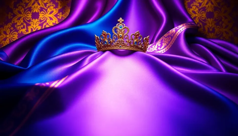

Ever walked through a grand palace or watched a historical film and wondered—what colors are royal colors? It’s a question that pops into many people’s minds, especially when you see those deep, majestic shades that just scream luxury and power.
Royal colors aren’t chosen by accident. They come from centuries of tradition, culture, and meaning. Whether it’s the castles of Europe or the temples of Asia, these colors have long been tied to power, spirituality, and prestige.
In this guide, we’ll dive into what exactly makes a color “royal.” We’ll explore popular royal color combinations used around the world, how they’re used today, and—most excitingly—how you can use them yourself, even if you’re not a pro designer!
What Exactly Are Royal Colors?
Royal colors are typically deeper, richer versions of everyday colors like blue, red, purple, green, and yellow. They’re not your average bright shades—they carry weight, depth, and a sense of luxury. When combined, they form what’s known as a royal colour scheme or a royalty color palette.
These colors often have historical roots. Back in the day, wearing certain shades was actually restricted to royalty or nobility. That’s why even now, these colors feel important and elegant.
It’s also fascinating how the meaning of royal colors shifts between cultures. While gold and purple are pretty universal, some colors like red and yellow have stronger ties to Eastern empires, while deep blues and purples are more classic in the West.
So, what colors are royal colors? Well, it depends—but they all share that luxurious, grand feeling.
Royal Colors in the West
When we think of Western royalty, we imagine European castles, crowns, and ceremonies. Here are some classic shades that define Western royal style.
Luxurious Gold
Gold is perhaps the most universal of all royal colors. In the West, it’s been used in palaces, cathedrals, and royal wardrobes to symbolize not just wealth, but something almost divine. It’s not a flashy yellow—it’s a deep, metallic gold that feels timeless.

Royal Blue
This isn’t just any blue. Royal blue is a deep, saturated shade historically worn by kings and queens—especially in England. It commands attention while still feeling traditional and serious.

Royal Purple
Purple has always been linked to royalty because, fun fact, the dye used to make it came from sea snails and was crazy expensive. Even today, royal purple gives off a vibe of mystery and luxury.

Regal Red
Red is powerful on its own, but its deeper version—regal red—is what you see in throne rooms and royal banners. It’s warm, strong, and impossible to ignore.

Regal White
White might not seem like an obvious royal color, but it’s used everywhere in palaces—as a background to make other colors stand out. It gives a clean, noble look that feels pure and elegant.

Royal Colors in the East
In the East, royal colors are just as rich but often come with different cultural meanings. In places like China, Japan, and India, color is deeply tied to philosophy, religion, and social structure.
Royal Yellow
In many Eastern cultures, yellow is the emperor’s color. In ancient China, only the emperor was allowed to wear it. It’s a bright, warm shade that stands for power and good fortune.

Royal Red
Red is huge in countries like China. It symbolizes luck, celebration, and authority. Walk through the Forbidden City, and you’ll see red everywhere—gates, walls, pillars, you name it.

Royal Gold
Just like in the West, gold is a big deal in the East. It’s used in temples, palaces, and art to highlight what’s important. It brings a feeling of luxury that’s hard to match.

Royal Purple
Purple is also used in Eastern royal contexts, especially in fabrics and decorative items. It’s often seen as spiritual, linked to wisdom and a touch of magic.

Royal Green
Now you might be wondering—is green a royal color? In the East, absolutely. Royal green is a calm, deep shade used in palace gardens, pottery, and traditional clothing. It represents nature, balance, and growth.

So yes, green can definitely be royal—especially where harmony and peace are valued.
How Royal Color Combinations Are Used Today
You don’t have to be royalty to enjoy royal colors. These shades are everywhere today—in design, fashion, branding, and more.
Historic Buildings & Art
Visit any old castle, museum, or cathedral, and you’ll notice royal colors everywhere. Take Windsor Castle, for example—it uses royal green, purple, and gold to create a sense of timeless grandeur.
Fashion
Royal colors are all over high-end fashion. Designers use deep blues, rich purples, and metallic golds to make their collections look expensive and elegant. And it’s not just clothes—bags, shoes, and accessories too.
Interior Design
More people are bringing royal colors into their homes. You don’t need a castle to pull off a royal colour scheme. A deep blue wall, a gold-framed mirror, or some purple cushions can make your space feel luxurious.
Product Packaging
Luxury brands love royal colors. Perfumes, chocolates, makeup—packaging in gold, purple, or deep red just feels more special and high-quality.
CapCut — Your all-in-one video & photo editing powerhouse! Experience AI auto-editing, realistic effects, a huge template library, and AI audio transformation. Easily create professional masterpieces and social media viral hits. Available on Desktop, Web, and Mobile App.

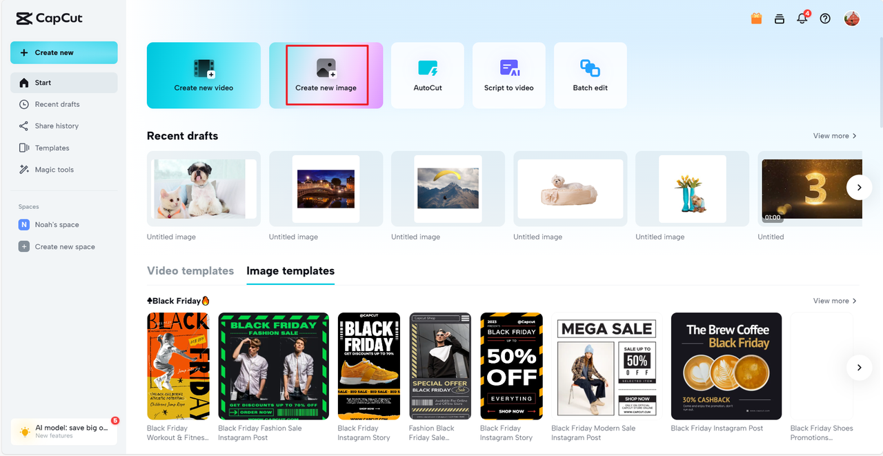
How to Create Your Own Royal Color Designs
Maybe you’re inspired to use royal colors—but how do you do it without everything clashing? That’s where smart tools come in.
You don’t need to be a designer to create something beautiful. With tools like CapCut Online, you can easily apply royal color combinations even if you’re just getting started.
Why CapCut Online Works So Well
CapCut Online isn’t just another editor. It’s built to help everyday people make pro-level designs. Here’s what you can do:
- Pick from pre-made royal color palettes
- Optimize colors with one click
- Use royal-themed templates for social media, posters, invites, and more
- Edit colors and text together easily
Making a Royal Design in 3 Easy Steps
Let’s say you want to make a social media post with a royal colour scheme. Here’s how simple it is:
Step 1: Upload Your Photo
Open CapCut Online and upload your image. You can use one you already have or start from scratch.
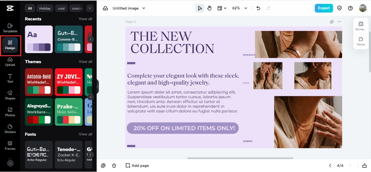
Step 2: Choose a Royal Template or Color Theme
Browse templates and pick one that fits the royal vibe. You can search for “royal gold,” “royal purple,” or anything you like.
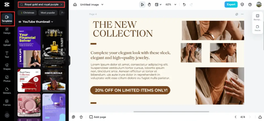
You can also use the color optimization feature to make sure everything matches perfectly.
Step 3: Export and Share Your Design
When you’re happy with your creation, just export it. Download it or share it straight to your socials.
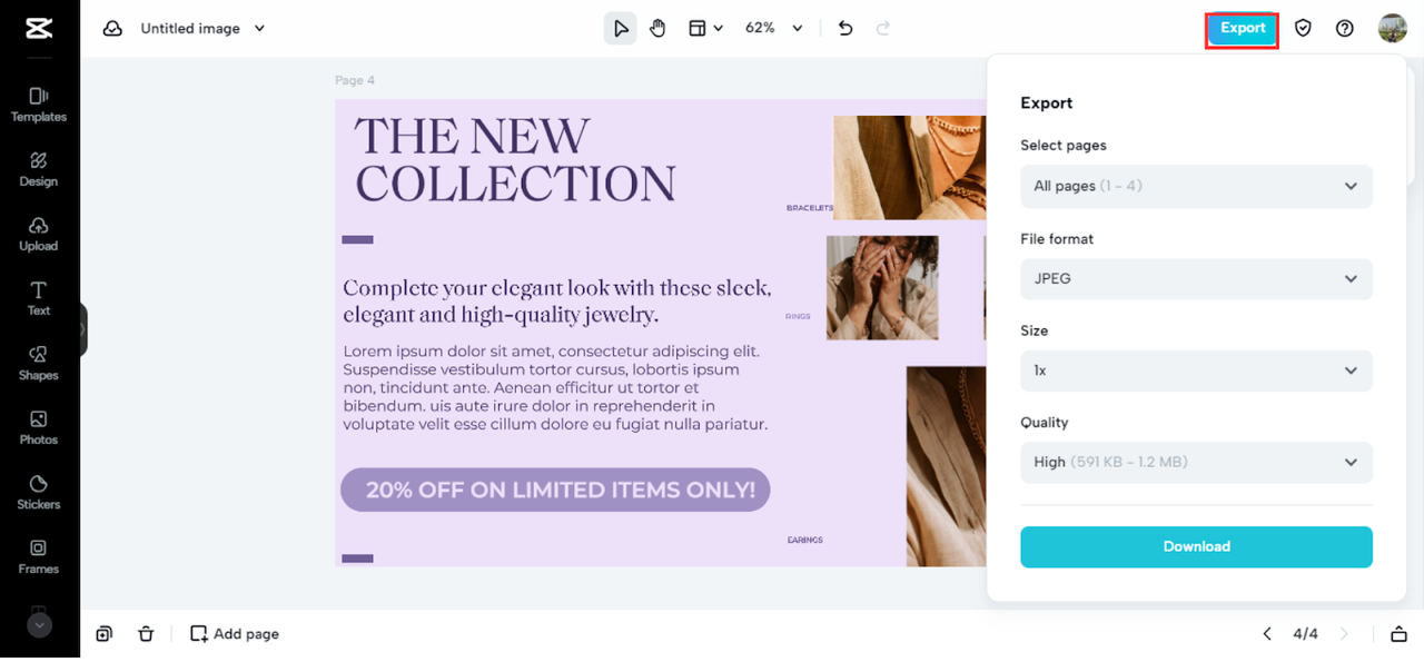
It really is that easy. No design degree required.
The Origins of Royal Color Combinations
Using these colors is fun, but knowing where they come from makes it even better. Many royal colour schemes are inspired by real palaces and landmarks.
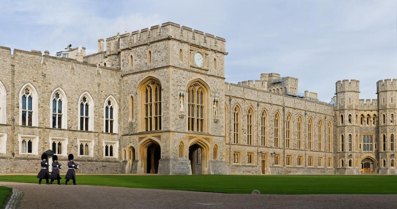
Windsor Castle
The largest inhabited castle in the world, Windsor uses a palette of royal green, pink, purple, and gold. It’s a perfect example of how these colors work together in real life.
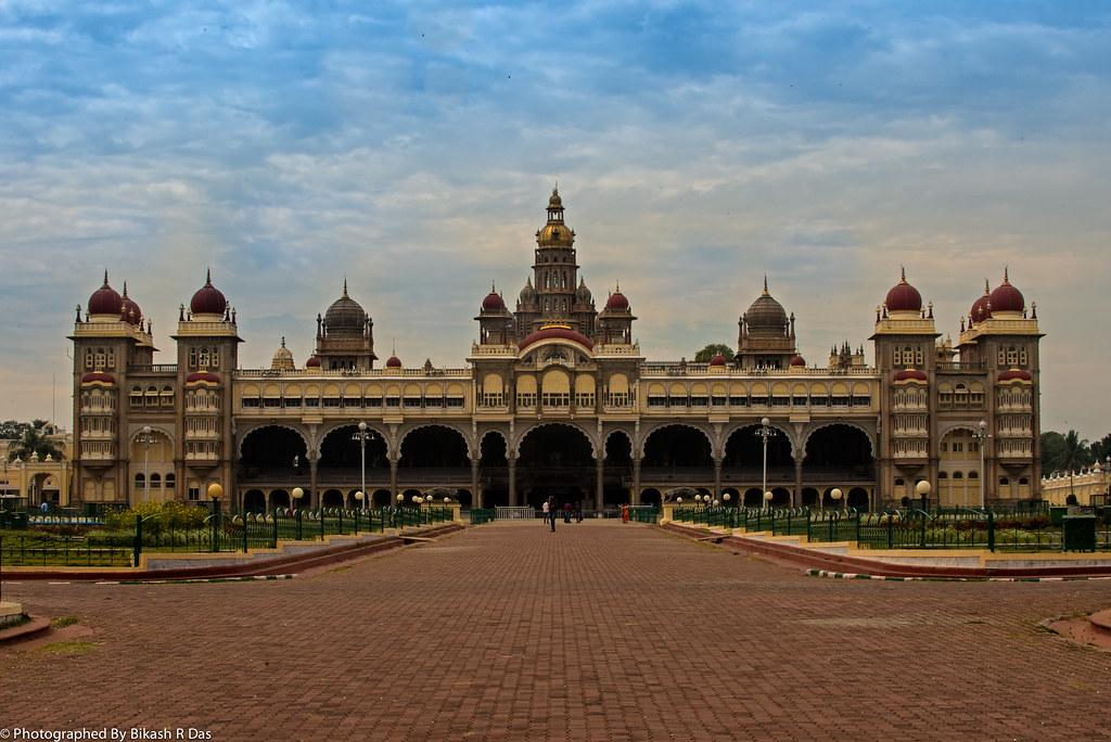
Mysore Palace
This Indian palace uses royal purple, pink, and gold in a way that’s both elegant and calming. It shows how different cultures blend colors differently.
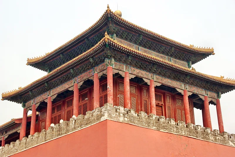
The Forbidden City
In Beijing, the Forbidden City uses royal red, blue, soft purples, and brown. Each color is deeply symbolic and tied to China’s imperial history.
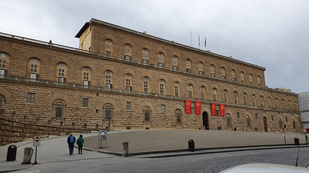
Palazzo Pitti
This Italian palace features deep brown, pale blue, gold, and red. It’s another great example of how royal colors create a sense of luxury.
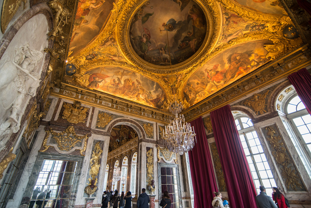
Palace of Versailles
Probably the most famous palace in the world, Versailles uses gray and gold in a way that’s both over-the-top and incredibly tasteful.
CapCut — Your all-in-one video & photo editing powerhouse! Experience AI auto-editing, realistic effects, a huge template library, and AI audio transformation. Easily create professional masterpieces and social media viral hits. Available on Desktop, Web, and Mobile App.
Wrapping Up
So, what colors are royal colors? As we’ve seen, the answer varies by culture—but what they all share is depth, richness, and a sense of importance.
And the best part? You don’t need to be royalty to use them. With tools like CapCut Online, anyone can create stunning designs with royal color combinations. Why not try it? A little royal purple or gold might be just what your next project needs.
FAQs
What is a royal color palette?
A royal color palette is a set of colors traditionally linked to royalty—deep blues, purples, reds, golds, and sometimes greens. Used together, they create a luxurious, elegant feel.
Which royal color scheme is best?
There’s no single “best” scheme—it depends on what you’re creating. Lots of people love gold and purple, or blue and gold. Tools like CapCut Online can help you choose based on your project.
How do I pick royal color combinations?
You can look at historical examples or use online tools with built-in color suggestions. CapCut, for example, offers pre-made templates that are already balanced and beautiful.
Is green a royal color?
Yes! In many Eastern cultures, green is considered royal. It often represents harmony, nature, and growth—so it’s perfect if you want a calm, balanced look.
Can I use royal colors in modern designs?
Absolutely. Royal colors aren’t just for old-fashioned stuff. They’re used in modern fashion, digital art, branding, and more. They add a touch of class that never goes out of style.
Some images sourced from CapCut.