Ever thought about using just one color for your whole design? It might sound limiting, but it’s actually a super effective way to make your work look clean, focused, and professional. Whether you’re designing a website, creating a brand identity, or even editing a video, sticking to a single color—but playing with its shades and tones—can bring everything together in a way that feels intentional and polished.
In this guide, we’ll explore what a monotone color palette really is, why it works so well, and how you can use it in your own projects. We’ll also look at some famous examples, check out helpful tools, and even dive into how to apply monotone colors in videos. Let’s get started!
What Exactly is a Monotone Color Palette?
A monotone color palette means using one base color and creating variations by making it lighter, darker, or slightly muted. It’s not about being boring or repetitive—it’s about using the full range of one hue to build depth and harmony. This approach keeps things simple but far from plain.
Think about the color blue, for example. You could use soft sky blue, a medium ocean tone, and a deep navy—all in the same project. Together, they create a balanced and cohesive look without introducing other colors that might clash or distract.
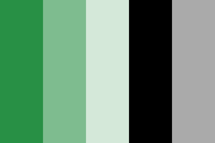
A lot of people hear “monotone” and think of black and white, but it’s much more than that. True monotone colors include every version of one single color. This kind of monotone colour scheme is popular because it’s flexible, easy to work with, and always looks put together.
Why Choose a Monotone Color Scheme?
There are plenty of reasons to go with a monotone palette. It’s not just a trend—it’s a practical and aesthetic choice that works across all kinds of design. Here’s why:
Visual Consistency
When you use different shades of one color, everything just fits. There’s a natural harmony between elements, which is especially useful in branding or web design where you want a unified look across pages or products.
Clean and Simple Design
Less can be more. A monotone color palette strips away unnecessary complexity and lets the layout, typography, and message take center stage. It’s perfect for presentations, infographics, or minimalist sites where clarity is key.
Emotional Impact
Colors carry emotion. Using a single color—like calming blue or energetic red—can strengthen the mood you’re trying to convey. A monotone blue color palette, for instance, can make a healthcare brochure feel serene and trustworthy.
Minimalist Aesthetic
If you love clean lines and modern design, a monotone colour scheme is your best friend. It’s often used in luxury branding, editorial design, and high-end packaging because it feels refined and intentional.
Directs Attention
With a monotone palette, you can use contrast to guide the viewer’s eye. Darker shades can emphasize important elements like buttons or headlines without breaking the overall flow. This is super useful in UI and UX design.
Great Examples of Monotone Artwork
Some of the most iconic artists and designers have used monotone colors to create powerful, emotional, and memorable work. Here are five famous examples:
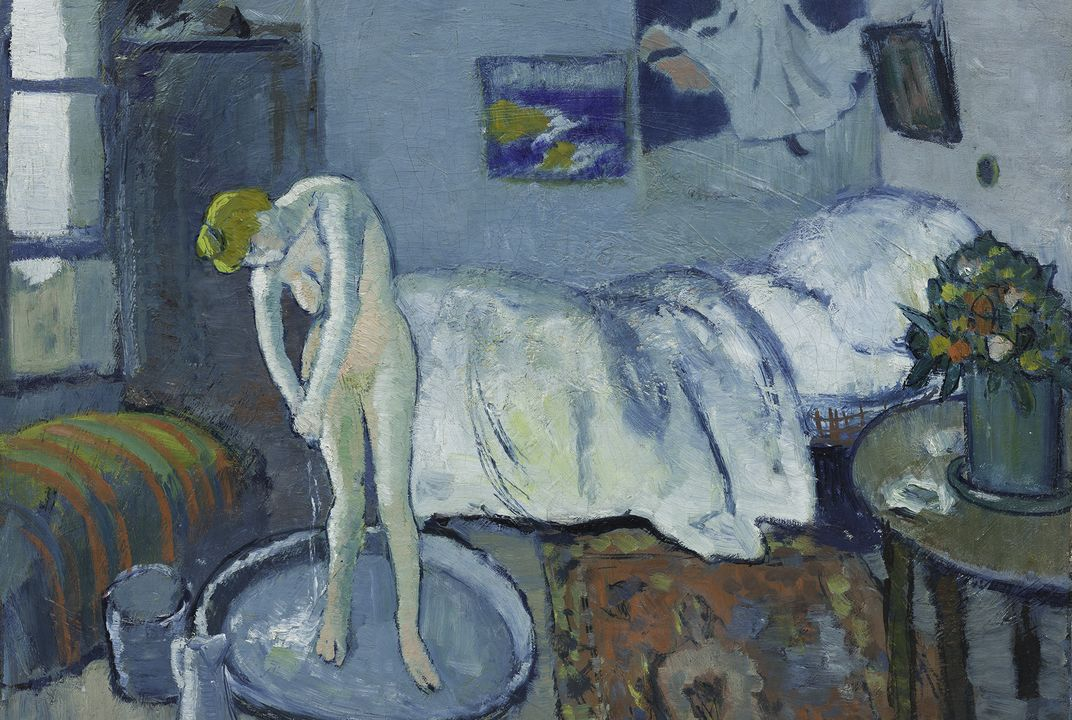
Pablo Picasso’s Blue Period
From 1901 to 1904, Picasso painted mostly in shades of blue. This period—known as his Blue Period—includes pieces like The Old Guitarist, which uses a limited blue palette to evoke feelings of sadness and solitude. The emotional weight of the monotone colors here is undeniable.
Mark Rothko’s Color-Field Paintings
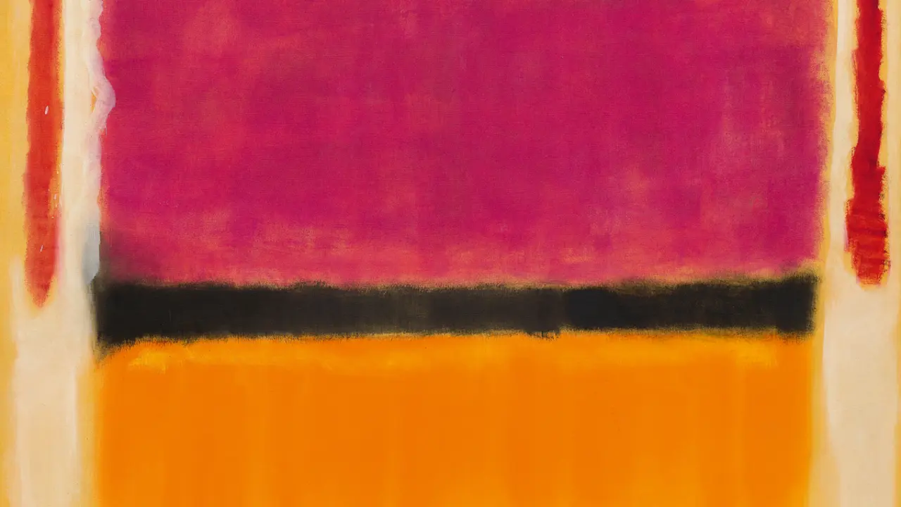
Rothko was a master of emotional abstraction. His large, soft-edged paintings often used a single color or close shades of one hue to create depth and feeling. Works like Orange, Red, Yellow pull you into a world of color and mood.
Yves Klein’s International Klein Blue
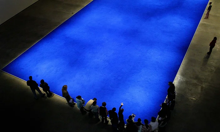
Yves Klein didn’t just use blue—he invented his own shade of it! His iconic International Klein Blue (IKB) is intense, vibrant, and totally immersive. Artworks like Blue Monochrome show how powerful a single color can be.
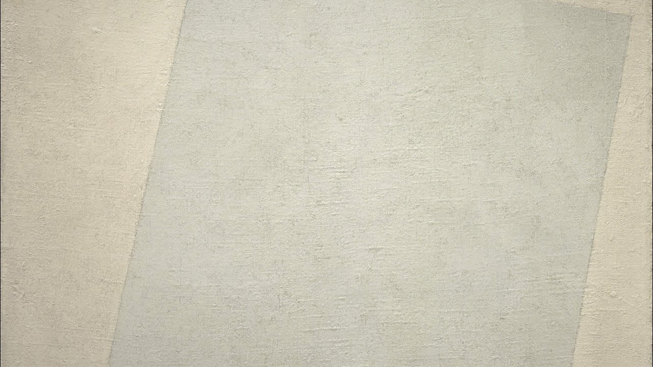
Kazimir Malevich’s White on White
Malevich, a pioneer of abstract art, created White on White—a painting that uses subtle variations of white to explore form and space. It’s a masterclass in simplicity and a classic example of minimalist monotone artwork.
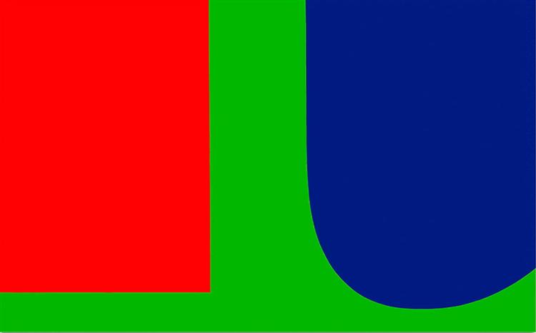
Ellsworth Kelly’s Bold Color Panels
Kelly often worked with solid, flat color shapes. His piece Blue, Red, Green uses three bold panels to explore how color can define space and create visual impact. It’s geometric, balanced, and beautifully monotone.
These examples show how versatile and expressive a monotone colour scheme can be—whether you’re creating art or designing a digital product.
Helpful Tools for Creating Monotone Palettes
You don’t have to be a color theory expert to create a beautiful monotone palette. There are tools that can help! Here are three of the best:
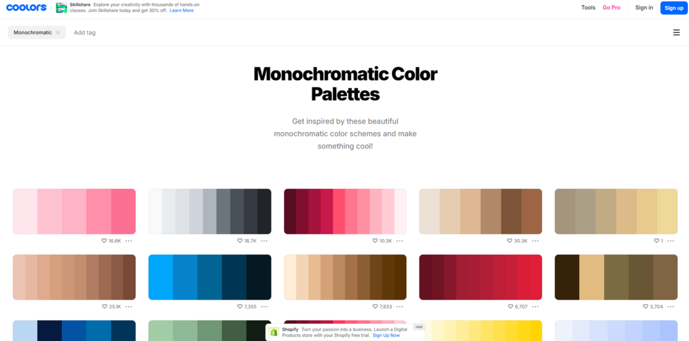
Coolors
Coolors is a user-friendly online tool that lets you generate color palettes in seconds. You can lock in a base color and quickly explore shades, tints, and tones that work together. It also offers export options and a library of pre-made palettes for inspiration.
Pros:
- Fast and easy to use
- Great for quick ideas
- Export in multiple formats
Cons:
- Some advanced features require sign-up
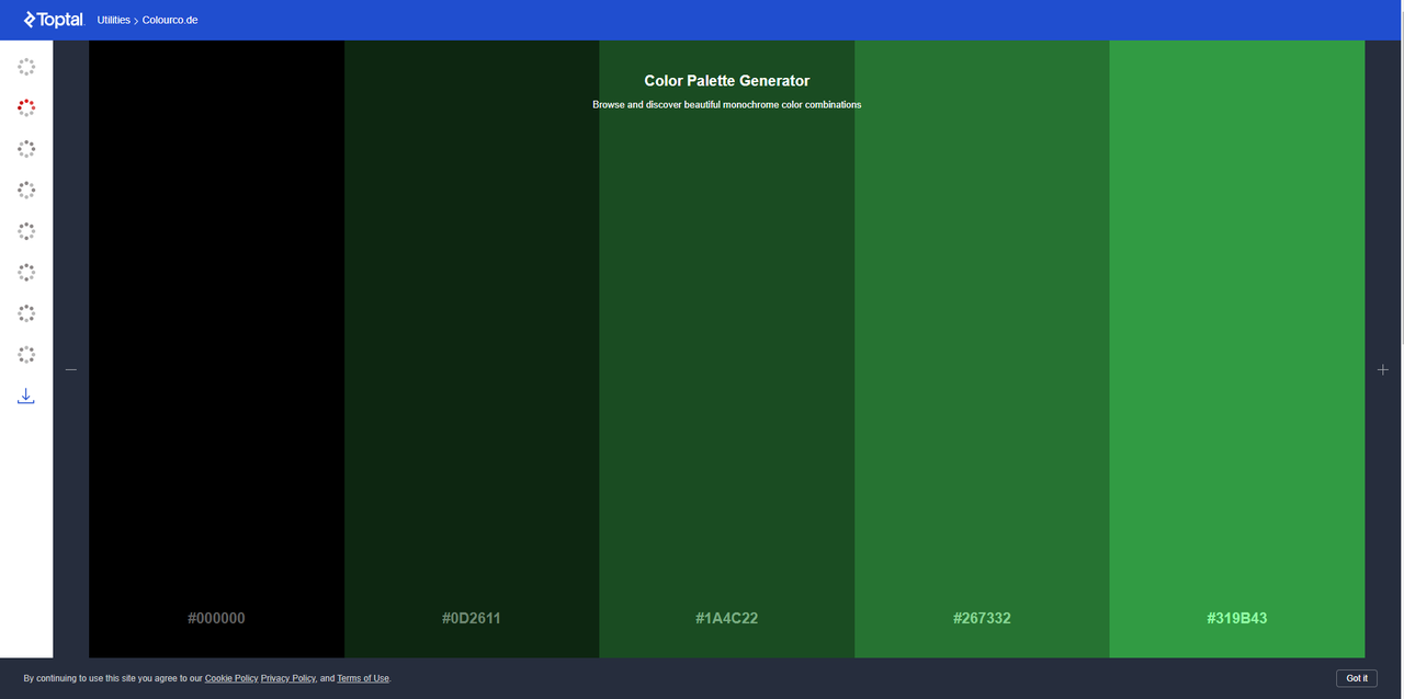
Toptal Color Palette Generator
Toptal’s tool is clean, professional, and perfect for designers who want more control. It allows you to fine-tune shades and offers live previews so you can see how your palette works in real time.
Pros:
- Live design preview
- Professional interface
- Precise adjustments
Cons:
- Fewer ready-made options
W3Schools Color Generator
Ideal for beginners and web developers, W3Schools offers a simple tool for creating basic monotone palettes. It also includes helpful tutorials on color theory—great if you’re just getting started.
Pros:
- Free and easy
- Educational resources
- Instant results
Cons:
- Limited customization
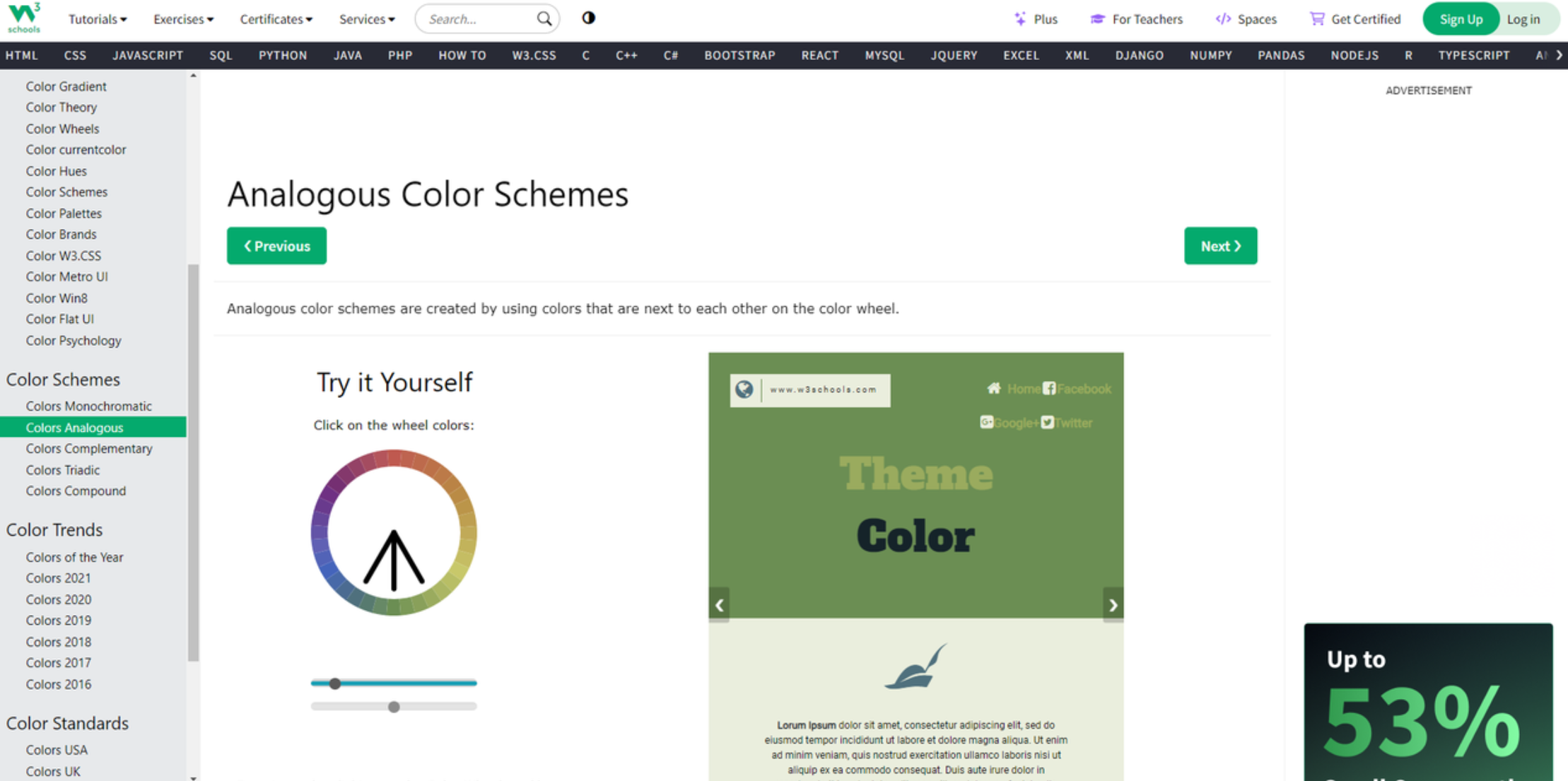
These tools make it easy to experiment and find the perfect monotone colors for your project.
How to Design with a Monotone Palette
Ready to start designing? Here are some practical tips for working with a monotone color palette:
Keep It Simple
Stick to one color family and focus on layout, contrast, and composition. This helps your design feel clean and intentional.
Use Color Overlays
Add depth to images or backgrounds with semi-transparent color layers. This adds visual interest without introducing new colors.
Create Visual Relationships
Use light and dark shades to group elements or guide the eye. This helps create a natural flow throughout your design.
Add Pops of Contrast
Even in a monotone scheme, a bright or accent color can make key elements stand out. Use it sparingly to highlight buttons, headlines, or calls to action.
Play with Texture and Pattern
Monotone doesn’t have to mean flat. Use textures, patterns, or gradients to add depth and keep the design engaging.
These strategies work for everything from graphic design and web layouts to social media content and video.
Using Monotone Colors in Video with CapCut
Videos can benefit hugely from a cohesive color palette. If you want to apply a monotone look to your videos, CapCut Desktop Video Editor is a fantastic tool to try. It’s packed with features that make color grading easy and fun.
CapCut — Your all-in-one video & photo editing powerhouse! Experience AI auto-editing, realistic effects, a huge template library, and AI audio transformation. Easily create professional masterpieces and social media viral hits. Available on Desktop, Web, and Mobile App.
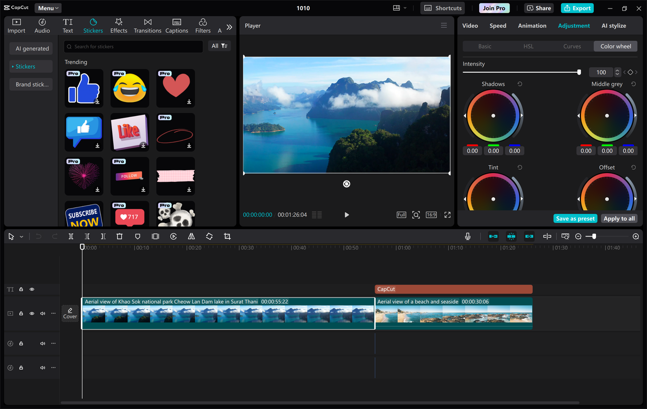
Key Features of CapCut
- Precise Color Wheel Control: Adjust specific colors with accuracy.
- Advanced Color Grading: Fine-tune brightness, contrast, saturation, and more.
- Background Color Presets: Quickly apply consistent color backgrounds.
- Custom Color Adjustments: Create your own unique looks.
- Auto Color Correction: Let AI enhance your video’s colors automatically.
How to Apply a Monotone Look in CapCut
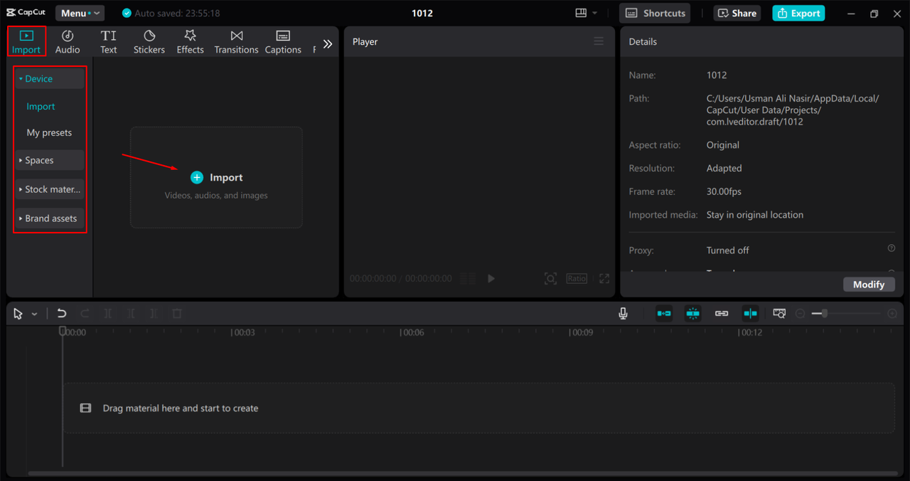
- Import Your VideoOpen CapCut, import your video, and drag it to the timeline.
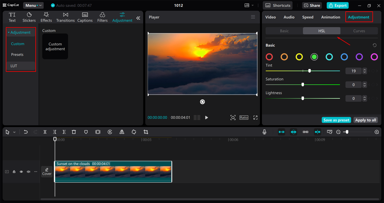
- Adjust ColorsGo to the Adjustments tab. Play with temperature, tint, saturation, and use curves or HSL for more control.
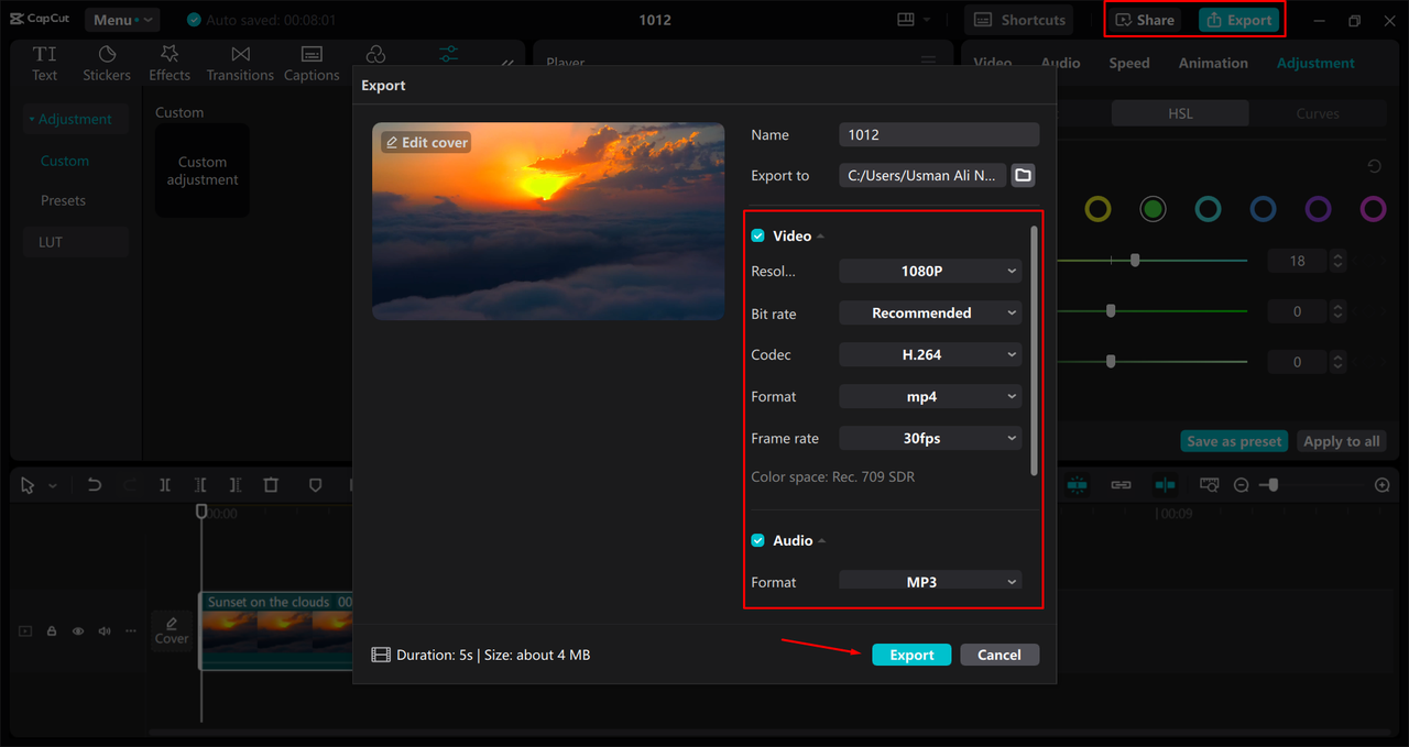
- Export and ShareWhen you’re happy with the look, export your video and share it with the world!
CapCut — Your all-in-one video & photo editing powerhouse! Experience AI auto-editing, realistic effects, a huge template library, and AI audio transformation. Easily create professional masterpieces and social media viral hits. Available on Desktop, Web, and Mobile App.
Wrapping Up
A monotone color palette is more than just a design trend—it’s a smart, effective way to create harmony, focus, and emotion in your work. Whether you’re designing a logo, a website, or a video, using variations of one color can help you achieve a polished and professional look.
And with tools like CapCut, it’s easier than ever to apply these principles to video. So why not experiment with a monotone colour scheme in your next project?
Frequently Asked Questions
Why are monotone color schemes so popular?
They create a cohesive, elegant look that feels intentional and easy on the eyes. They’re especially useful in video, where color consistency can make a big difference. Tools like CapCut make it simple to apply monotone colors to video projects.
What colors can be used in a monotone palette?
Any color! You can use different shades, tints, and tones of one base color. For example, a blue palette could range from pale sky blue to deep navy.
What are some of the best monotone palettes?
It depends on the mood you want to create. Blues are calming, greens feel natural, reds are energetic, and grays are neutral and modern. The best palette is the one that fits your message.
Some images sourced from CapCut.
 TOOL HUNTER