 TOOL HUNTER

Selecting the perfect color combinations for your website is like choosing the right outfit for an important occasion—it needs to represent who you are while making a great impression. Colors do more than just make your site look attractive; they communicate emotions, influence how visitors perceive your brand, and can even affect whether they make a purchase or explore further.
Think about your favorite brands. The colors they use aren’t random—they’re carefully chosen to make you feel a certain way. In this guide, we’ll explore why colors matter so much in web design, introduce you to some amazing tools for creating beautiful color schemes, and walk you through how to add brand colors to CapCut so your videos and website always look cohesive and professional.
How Website Color Choices Influence User Behavior
Believe it or not, the colors on your website can subconsciously shape how visitors behave. Major companies invest significant time and resources into selecting just the right color schemes because they understand the psychological impact of color.
If you’re looking for inspiration, some of the world’s most successful brands offer masterclasses in effective color use.
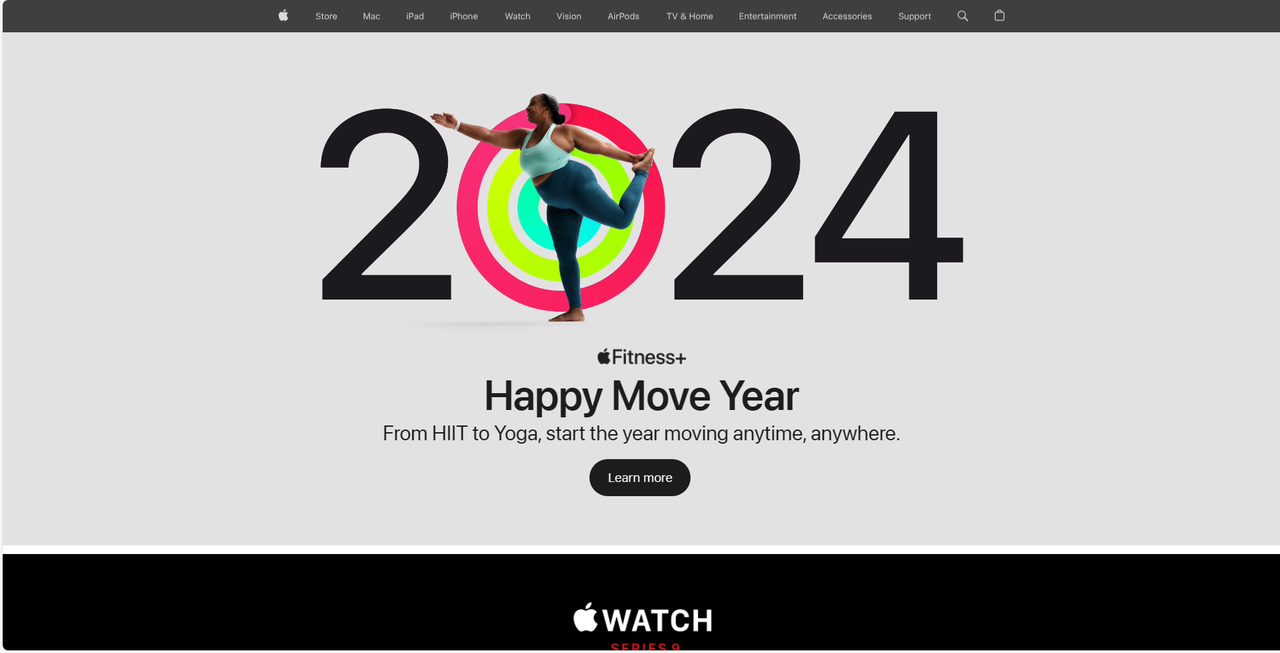
Apple keeps things mostly neutral with whites and grays but adds small bursts of vibrant color to highlight key elements. This creates a clean, modern look that feels both sophisticated and engaging.
Google embraces primary colors—red, blue, yellow, and green—in a playful way that makes their interface feel friendly and approachable, perfectly matching their innovative spirit.

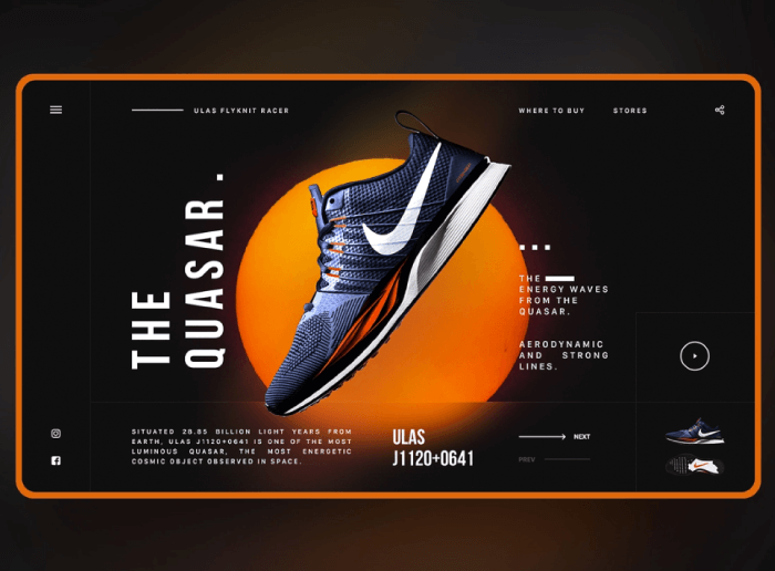
Nike combines powerful black with energetic orange to create a bold, dynamic look that screams confidence and motivation—perfect for a brand all about movement and achievement.
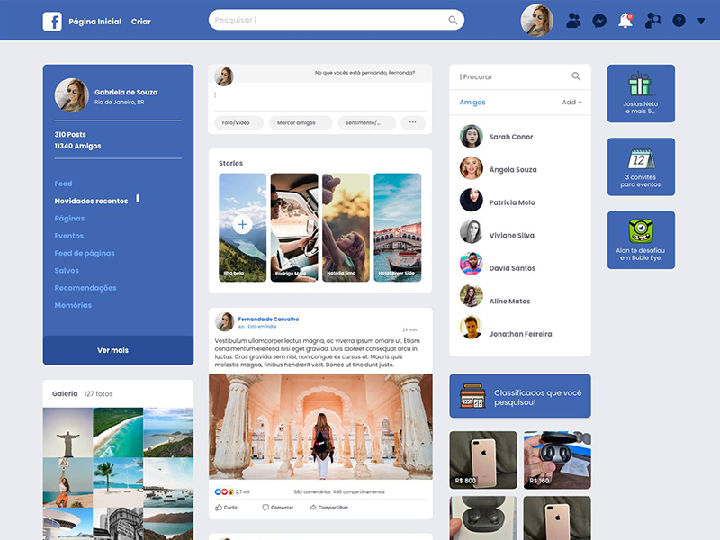
Facebook uses various shades of blue throughout its platform, creating a sense of trust and calm that helps users feel comfortable sharing and connecting with others.
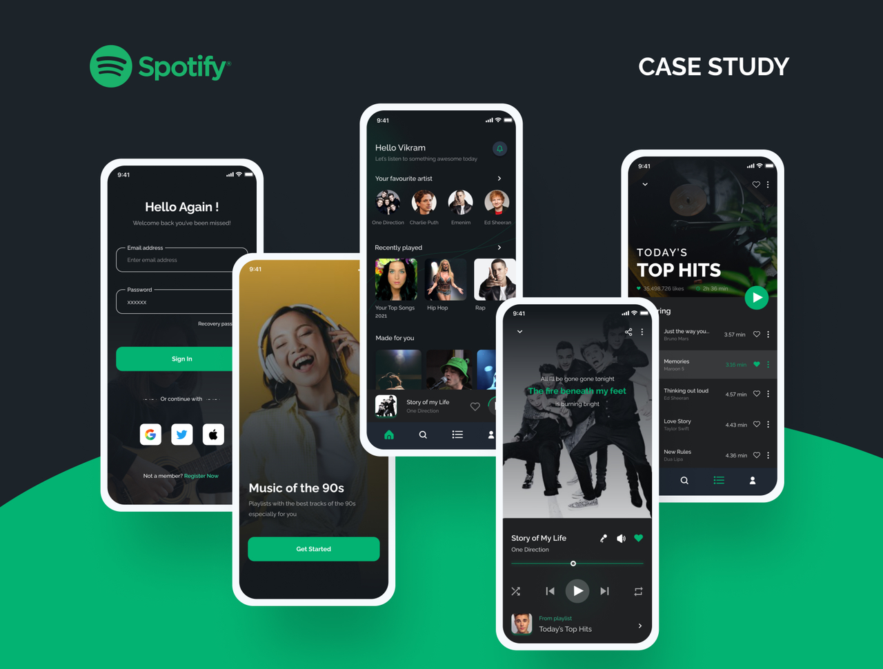
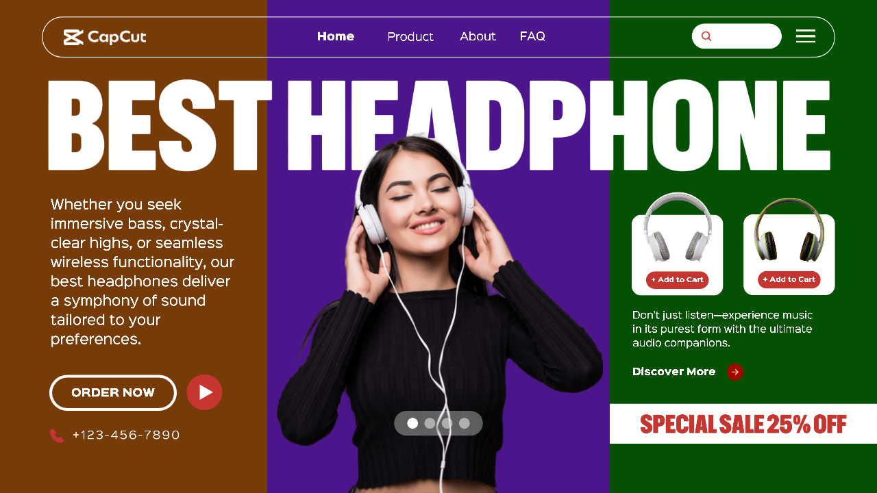
Spotify pairs vibrant green with deep black for a look that’s both energetic and sophisticated, perfectly capturing the excitement of music discovery.
These companies understand color psychology—how different hues affect emotions and behaviors. By carefully selecting their color schemes, they create experiences that keep people engaged and connected to their brands.
Excellent Tools for Creating Beautiful Website Color Combinations
Fortunately, you don’t need to be a color theory expert to create stunning color schemes for your website. Several fantastic tools can help you develop professional-looking color combinations that will make your site stand out.
How to Add Brand Colors to CapCut for Website Design
While primarily known as a video editing platform, CapCut offers surprisingly powerful color tools that are perfect for web design work. Learning how to add brand colors to CapCut can help you maintain consistency across all your visual content.
The color themes feature provides pre-designed palettes that take the guesswork out of color matching. These ready-made combinations ensure all your colors work harmoniously together.
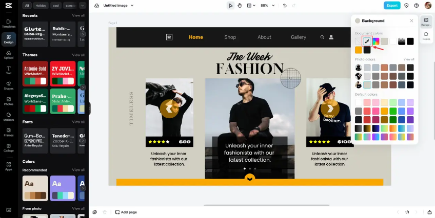
With the color picker tool, you can extract exact colors from any image or design element, making it simple to match colors perfectly across different materials.
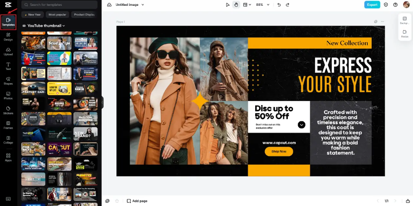
CapCut’s templates come with professionally designed color schemes already implemented, giving you a great starting point for your projects.
The optimize color feature automatically adjusts colors to ensure they look great on different devices and screen types, which is crucial for web design.
You can also easily remove or change backgrounds, which is incredibly helpful when working with specific color schemes or creating transparent elements for your website.
Creating color combinations with CapCut
Here’s how to use CapCut’s color tools to develop beautiful website color schemes:
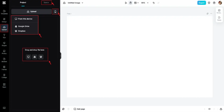
Start by creating a CapCut account and beginning a new project. Upload your images either from your computer or by dragging and dropping them into the workspace.
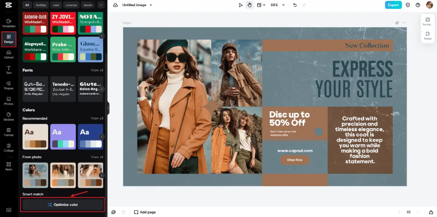
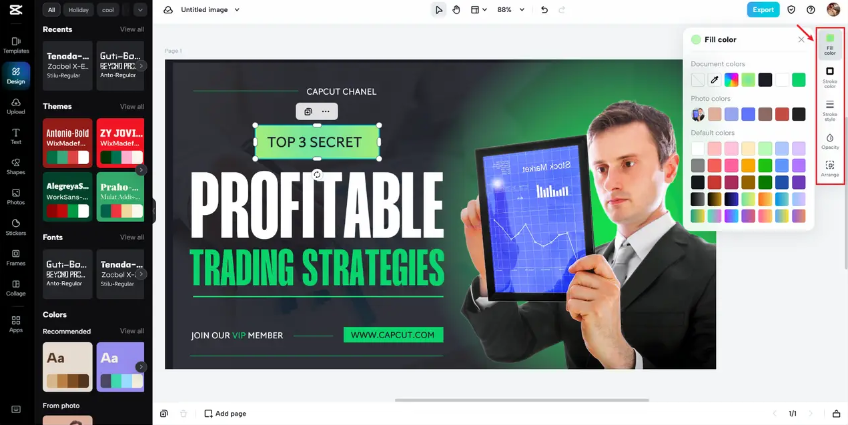
Choose a color palette that matches your vision. If you’re inspired by Spotify’s look, for example, search for templates featuring vibrant green and black combinations.

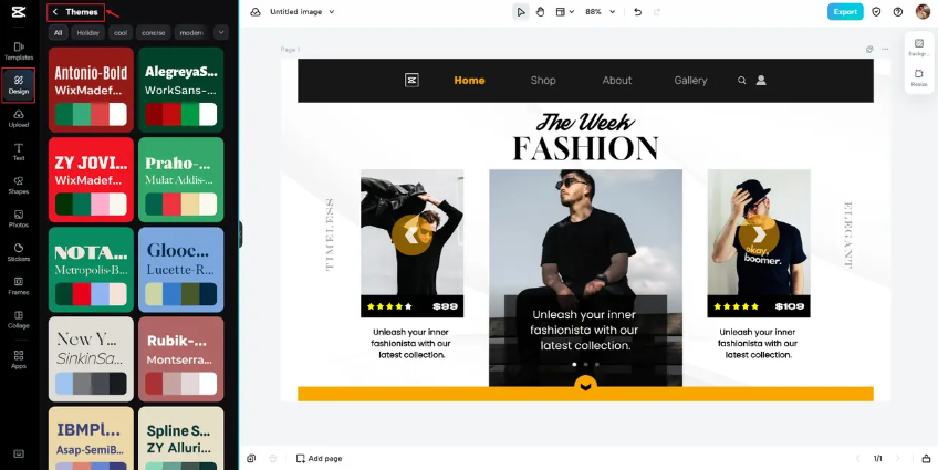
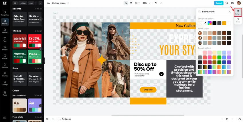
Navigate to the Design section to explore color palettes. Select one that appeals to you from CapCut’s suggestions, then use the optimize color feature to enhance the colors further.

Fine-tune your colors by adjusting parameters like warmth, tint, and saturation manually, or use AI color correction for automatic enhancements.

If you need to modify specific colors in your design, access the Basic settings on the right panel and choose new colors for individual elements.
Once you’re satisfied with your color scheme, export your design by clicking the Export button. You can select your preferred size, format, and quality settings before downloading.

Understanding how to add brand colors in CapCut is incredibly valuable for maintaining visual consistency across your video content and website. The process of how to add brand colors to CapCut becomes simple once you’re familiar with the platform’s color tools.
CapCut — Your all-in-one video & photo editing powerhouse! Experience AI auto-editing, realistic effects, a huge template library, and AI audio transformation. Easily create professional masterpieces and social media viral hits. Available on Desktop, Web, and Mobile App.

Adobe Color
Adobe Color stands as a professional-grade tool favored by designers worldwide. It offers sophisticated features for creating precise color schemes.
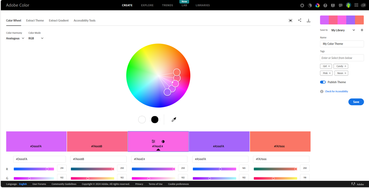
The platform allows you to explore community-created palettes or build your own from scratch. You can fine-tune colors using CMYK, RGB values, and brightness controls for absolute precision.
The Extract Theme feature is particularly useful, generating color palettes directly from uploaded photographs.
Adobe Color works seamlessly with other Adobe Creative Cloud applications, making it ideal for professional designers and developers. The main limitations are its subscription-based model, which might be expensive for some users, and its requirement for an internet connection since it’s cloud-based.
ColorSpace
ColorSpace simplifies the process of creating color palettes. Just input your preferred color using RGB values or a hex code, or select one from the color wheel, then generate numerous options based on your selection.
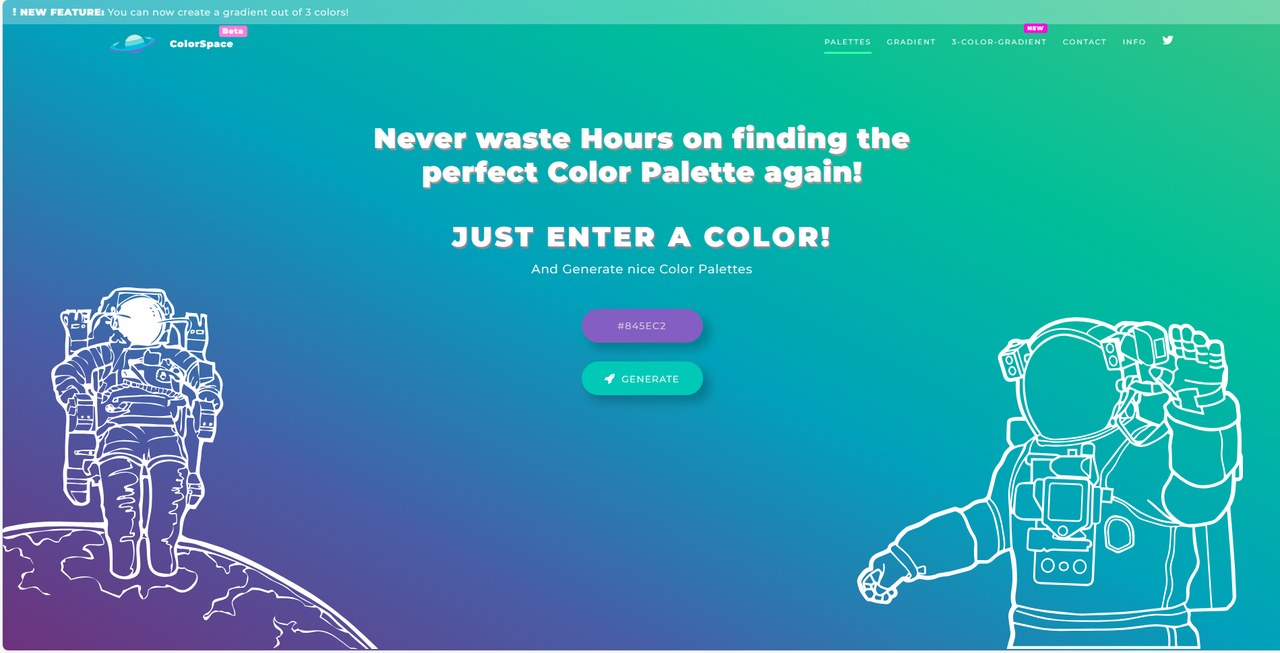
The color palette generator creates harmonious combinations that work well together. With access to over 2000 color shades, you can develop truly unique palettes for your projects.
ColorSpace offers precise color management and flexible options suitable for various project types. It includes advanced color correction tools but may present a learning curve for beginners. Regular updates are necessary to maintain optimal performance.
Paletton
Paletton offers a user-friendly approach to color selection based on traditional color wheel principles. Choose a base color and discover harmonious options that complement it, or generate random palettes for inspiration.
The tool allows manual fine-tuning by entering specific hue degrees and provides live previews of how your color choices would appear on an actual website.
Paletton excels at creating harmonious color schemes and inspiring creative combinations. It requires an internet connection to function and performs best when kept updated to the latest version.
Colormind
Colormind provides flexibility in color selection, allowing you to input custom colors or generate five-color palettes automatically. You can visualize how your palette would look on a sample website layout.
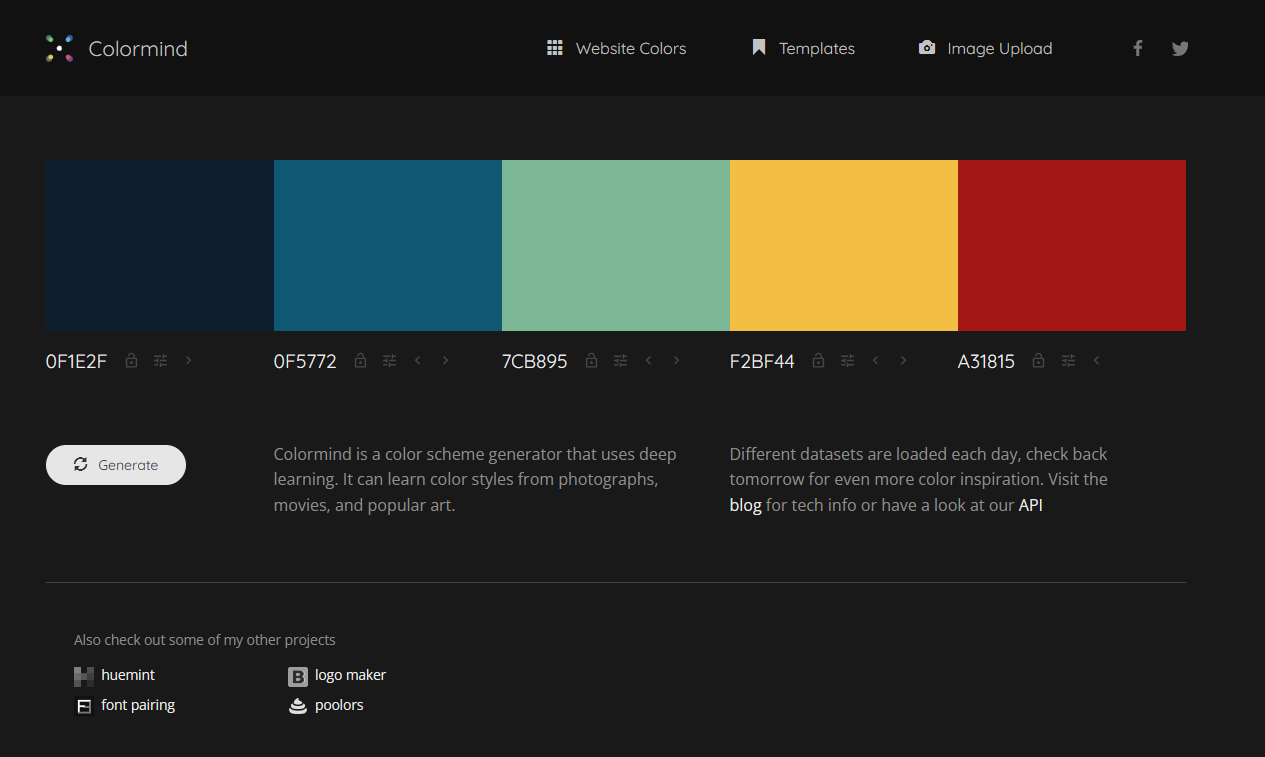
The Preview Mode displays your color choices in a website format, while Dark/Light Mode lets you test how colors perform in different lighting environments.
Colormind maintains your preferred colors within palettes and helps ensure brand color consistency. It may lack some specialized color manipulation features available in more advanced tools, and the quality of generated palettes depends heavily on your initial input.
Understanding Color Theory and the Color Wheel
Basic Color Theory Principles
Color theory provides the foundation for creating harmonious color combinations by explaining how colors interact and influence each other.
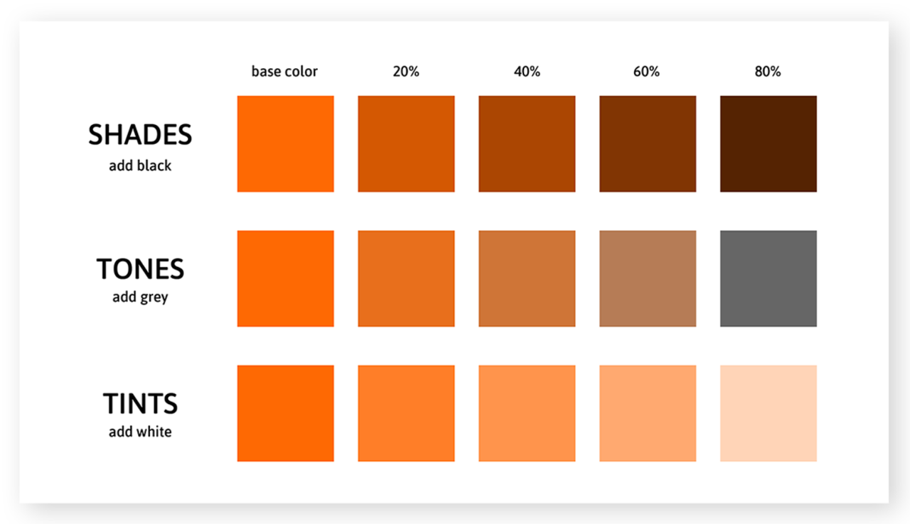
Shade, tint, and tone represent different variations of a color. A shade is created by adding black to a color, making it darker. A tint results from adding white, making it lighter. A tone is produced by adding gray, creating a more muted version.
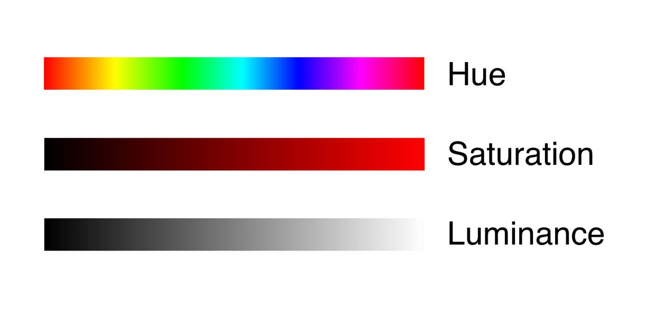
Hue refers to the pure color itself, saturation describes the intensity or purity of the color, and luminance indicates how light or dark the color appears.
Practical Application of the Color Wheel
The color wheel visually represents color relationships, serving as an essential guide for creating effective website color combinations.
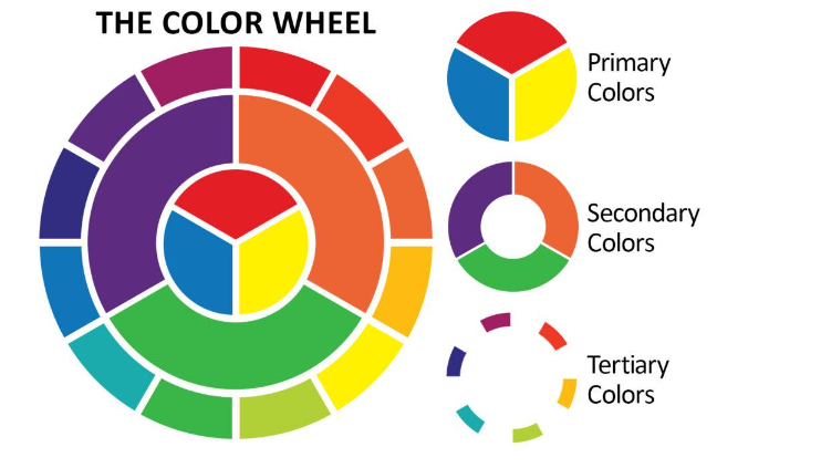
Monochromatic schemes use different shades, tints, and tones of a single color. This approach creates a clean, elegant look that works particularly well for minimalist website designs.
Complementary colors sit opposite each other on the color wheel. These pairings create strong contrast and visual vibrancy, making them ideal for highlighting important elements like call-to-action buttons.

Analogous colors are located next to each other on the color wheel. These combinations create harmonious and cohesive visual experiences that feel naturally unified.

Triadic color schemes use three colors equally spaced around the color wheel. These combinations blend warm and cool tones effectively, working well for websites with diverse audience appeal.
Tetradic schemes incorporate four colors arranged in complementary pairs. These rich, vibrant combinations are perfect for creative websites that want to make a bold visual statement.

Implementing Your Color Strategy
Creating effective website color combinations requires both artistic sensibility and strategic thinking. The color wheel serves as your guide to harmonious designs, whether you prefer the simplicity of monochromatic schemes or the energy of tetradic combinations.
Among the various tools available, CapCut Online offers a comprehensive solution with features for precise color palette selection. Your color choices significantly impact how users perceive and interact with your website, making them worth careful consideration.
For those maintaining brand consistency across multiple platforms, learning how to add brand colors in CapCut proves incredibly valuable. This knowledge ensures your video content matches your website’s color scheme perfectly. The process of how to add brand colors to CapCut is designed to be user-friendly, helping you maintain a consistent visual identity across all your content.
Don’t hesitate to experiment with different color schemes—sometimes the most memorable designs come from unexpected combinations. Your willingness to explore creative options could result in a truly distinctive web presence that resonates strongly with your audience.
CapCut — Your all-in-one video & photo editing powerhouse! Experience AI auto-editing, realistic effects, a huge template library, and AI audio transformation. Easily create professional masterpieces and social media viral hits. Available on Desktop, Web, and Mobile App.
Frequently Asked Questions
What are the best color combinations for websites? The ideal color combinations depend on the emotional response you want to evoke and how well they represent your brand identity. Harmonious schemes like analogous or complementary colors often work well as they create visually appealing and unified user experiences.
How do I pick colors for a website? When selecting website colors, consider your brand’s personality and the emotions associated with different colors. Use tools like CapCut Online to experiment with various color schemes, ensuring your choices align with your website’s objectives. If you create video content, learning how to add brand colors to CapCut will help maintain visual consistency across platforms.
What are good website colors? Effective website colors accurately represent your brand, appeal to your target audience, and ensure readability. Neutral tones like blues, greens, and grays remain popular choices due to their versatility and clean appearance.
How do I select the best web design color combinations? To choose optimal web design color combinations, apply color wheel principles. Experiment with monochromatic, complementary, or analogous schemes using tools like CapCut for precision. Ensure your selected colors support your website’s purpose and enhance the user experience. If you produce video content, understanding how to add brand colors in CapCut helps maintain cross-platform consistency.
What effect does blue color combination have on a website? Blue color schemes typically convey trust, calmness, and professionalism. Associated with reliability,

